")
Last Updated on May 30, 2023 by Rose Morah
The energy app on Tesla gives you a more accurate range estimate compared to the estimated range on the display screen that doesn’t take into account your driving habits.
Tesla’s energy app is in most cases very accurate because it uses your driving habits and environmental conditions to estimate the range.
However, the data provided on the energy app are quite intimidating to most Tesla owners.
Therefore, we are going to be discussing how to read the Tesla energy app.
How to read the data on the Tesla energy app
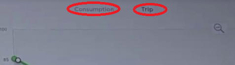
After tapping the energy icon on the screen, the consumption graph will automatically pop out.
Above the graph, you will be able to see the “Consumption” and “Trip” buttons as shown in the image below.
You may also like:
How Long Does a Tesla Battery Last? (Tesla Battery Degradation).
Tesla Home Charging Guide (Tesla Charging Tips).
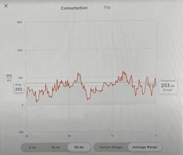
How to read the “Consumption” graph in the Tesla energy app
See also: How To Check Tesla Battery Health/Battery Degradation.
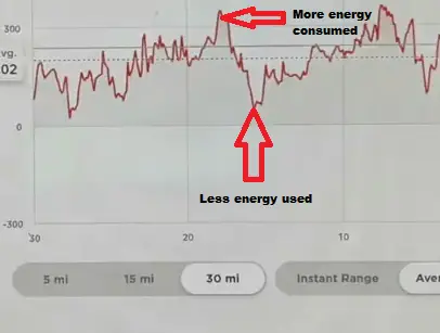
- The vertical line on the left side shows the energy used.
Note: The lower the number on this side of the graph, the lesser energy your Tesla is using. The higher the number, the more energy is being consumed.
- The horizontal line on the graph is the number of miles or kilometers traveled.( i.e 5,15,30 mi)
- The horizontal lines in the middle of the graph, as seen in the image below, show the EPA range that is on your display (i.e the less accurate range) which is the solid line.
See also: Plugshare VS ChargePoint: Which Is Better?
The dotted line shows the more accurate and reliable range.
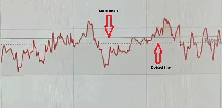
The dotted line tends to move up and down and when you have less range, it will be above the solid line.
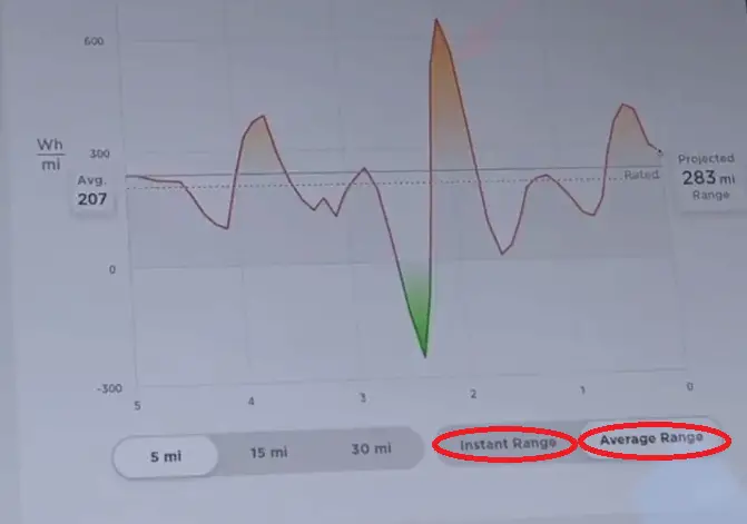
- At the bottom of the horizontal line, there are two buttons: “Instant Range” and “Average Range”.
The “Instant Range” is used when you want to see instant range impacts based on your driving habits.
For instance, when you want to check how much range impact you will get when driving down/up a hill or when it’s very windy or even cold.
The instant range impact will also be noticeable when you step hard on the accelerator.
The “Instant Range” will therefore not be useful, especially if you want to know the amount of range left in your battery because you will start to see a fast up and down change in the projected range.
On the other hand, the “Average Range” gives you a more accurate projected range. Therefore, it is more useful if you want to find out how many miles are left in the battery.
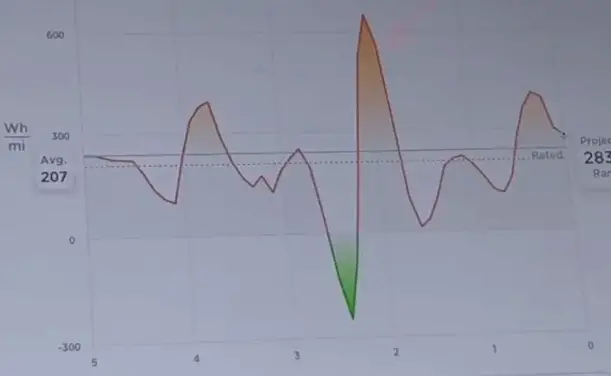
- The lines on the graph show the energy being consumed or added to your battery
The higher the line, as seen in the image below, the more energy you are using.
- On the vertical line that represents the energy used, if the line on the graph is above the horizontal line marked 0, this is the energy being consumed. But on the other hand, if the line is below 0, this is the energy being put back into the battery through regenerative braking. (Refer to the image below)
You may also like:
Best Gifts Ideas For Tesla Model 3 & Y Owners.
ABRP On Tesla Screen: How To Link ABRP To Your Tesla.
- The green shaded color on the graph, as seen in the image below, represents the energy being produced and the orange shaded color represents the energy used.
If you tap on the trip option, you will be able to see a different graph from the one on the “Consumption”.
The graph on the “Trip” option shows you how much battery will be remaining when you arrive at your destination. (17% in this case)
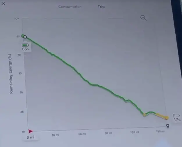
NOTE: You have to have set a destination on the navigation for it to work.
See also:
How To Calibrate Tesla Cameras (Everything You Need To Know).
Is The Tesla Extended Warranty Worth It? (Read This Before You Purchase It).
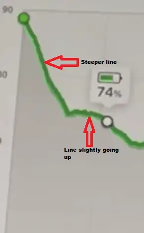
How to read the “Trip” graph in the Tesla consumption app
- On the “Trip” graph, you may notice two colored lines, a green and a gray line.
The gray line shows the originally projected energy consumption for that trip. The green line is the actual energy consumption.
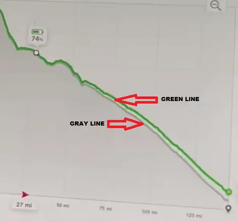
- If the green line seems to be going down at quite a steeper rate, this means that the car is using the most energy. This is mostly when you are driving up a hill.
- When the green line is going up, as seen in the image below, this means that you are using less energy.
")

")